Behind The Scenes #3
Level Design, Station Modules & Creative Rewards
Hello again, Tech-Pilots!
Time for another Behind The Scenes update! Malte, our level designer, will share insights on how he approaches level design for a fast-paced space shooter like EVERSPACE 2 and how he creates huge space stations from a set of highly-detailed, handcrafted modules.
New Creative Rewards
Before Malte gets cracking, we also wanted to share some information about the addition of further creative rewards. Since we got so much positive feedback about the alien wildlife in last Friday’s update, we thought some of you might be interested in working with us to create a living & breathing gameworld in EVERSPACE 2.
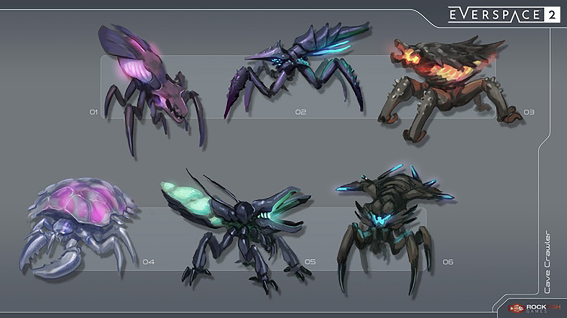

Now, we understand that these creative rewards are fairly high-priced, but bear in mind that a lot of effort goes into such design processes. Also, it is quite an exclusive opportunity to directly work with the dev team on iconic game content for a much bigger sequel to a very successful space shooter with a fairly large fanbase like EVERSPACE.
Of course, having additional creative reward tiers at various premium price points can also help us tremendously in reaching our funding goal, soon. But now, over to Malte!
Level Design: The Flow Of Movement
Regarding all things level design, I set myself one major rule for the original EVERSPACE that I tried to follow as much as possible: From the very beginning, it was clear that our ship movement would be very fast, like ridiculously fast. If I had to describe it, I’d use the word “dancing”. This concept is something I wanted to explore even further in EVERSPACE 2.
Levels need to be fun! And the closer the actual game mechanics can be reflected in the level design, the better. EVERSPACE has always been a game close to something like a fast-paced action shooter where players might triple-jump to higher ground, fire back some rockets, dodge an incoming projectile and jump down spinning around while accidentally hitting a barrel in the background, setting the whole place afire.

Whereas most space games these days take a more realistic approach when it comes to speed, controls and movement, I feel like this just isn’t fun enough. Or in other words, it already exists out there. So, how can we create points of interest where even the most basic mechanics like the flow of movement can already be a ton of fun in itself? I like to think of all the places you can visit, explore and fight or race through as a playground similar to something you might experience in a skate game.
Think of an amusement park with Formula One tracks – in space of course! Welcome to this new arena! Go ahead and just see what you can do! If you love the sensation of flying insanely fast while being in full control with your hands on the stick, the world needs to visually encourage you to do exactly that. As much as possible. And that’s just it.
Giving you literally enough “space of fun” from a level design perspective so that you’ll enjoy yourself is one thing to have (which is no problem in space) but really the balance makes the staying worthwhile.
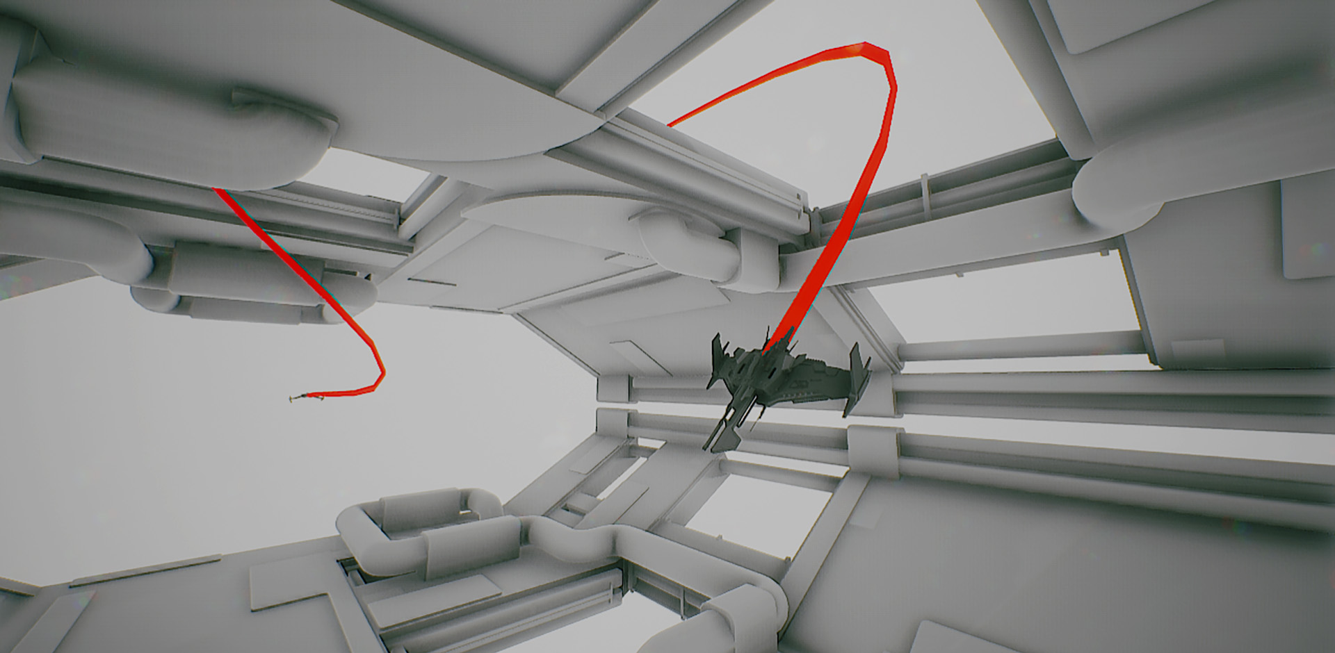
Space Of Fun
It’s all about the question “Can I do that”? As you rush towards a mining station being followed by enemy spaceships whose missiles just passed by way too close for comfort… Yes, you can! And frankly, you should!
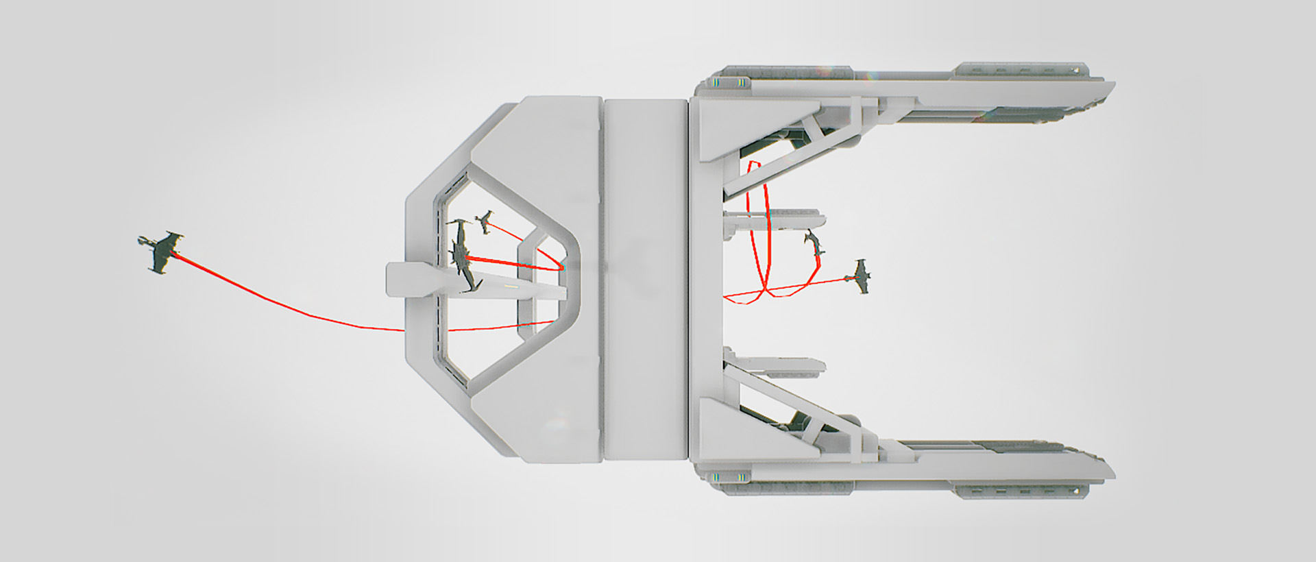
Creating shapes and silhouettes that invite the player to seek and explore are essential. From race-like checkpoint circles to shapes that simply seem to be asked to be closely investigated. Interior spaces should also follow the rule of fast exits. If you enter something you definitely don’t want to feel lost or have trouble finding your way out. We never want to lose the sense of speed.
Of course, it’s also fun to break this rule for things like interior asteroid caves, but space is your playground. If it looks like you can use certain spots to hide from enemy fire or take a fast shortcut through a docking bay to surprise the enemies on the other side then you should be able to do exactly that. And that’s where the flow of movement gets to be fun as hell! It’s the sort of fun that will be a really close companion to other mechanics which will find their way into the upcoming Alpha and Beta builds.
In Closing
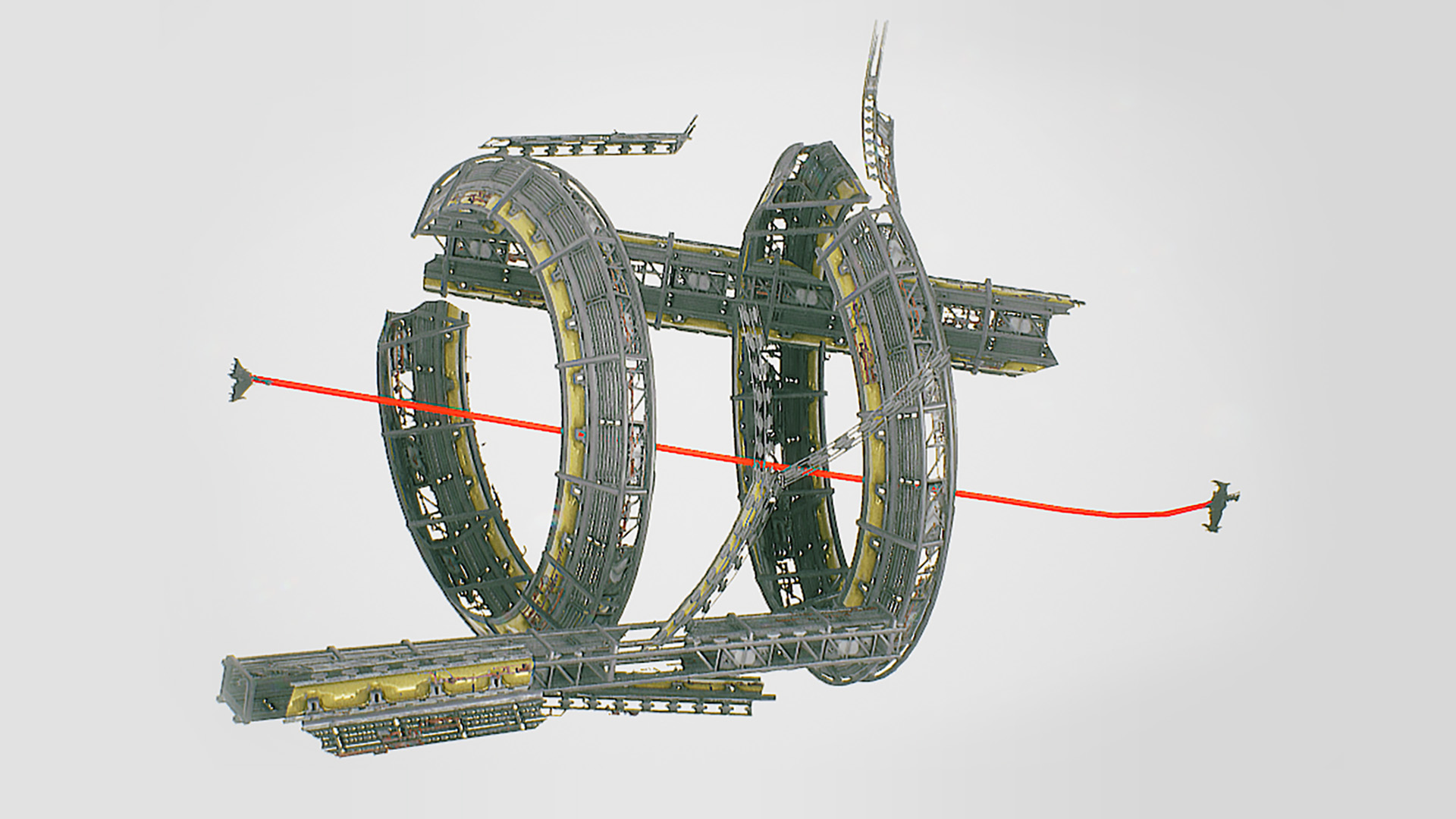
Regarding movement, I never really liked the idea of huge space stations that are simply impressive by their size alone. As always, it’s about what you do with it and not about the size, but I digress.
A huge station might be fun to approach, might be fun to land on for the first time. But having small to medium-sized fun modular set pieces, that can be pieced together, is where it’s at with EVERSPACE 2.
This gives better control over creating bigger environments and additionally has the side effect of more opportunities for new gameplay mechanics which we will continue to implement in the near closed Alpha and future of EVERSPACE 2. Having said that, there will of course also be huge stations that function just as city HUBS. Accepting quests. Meeting new NPCs etc. I can’t wait for you to experience all this.
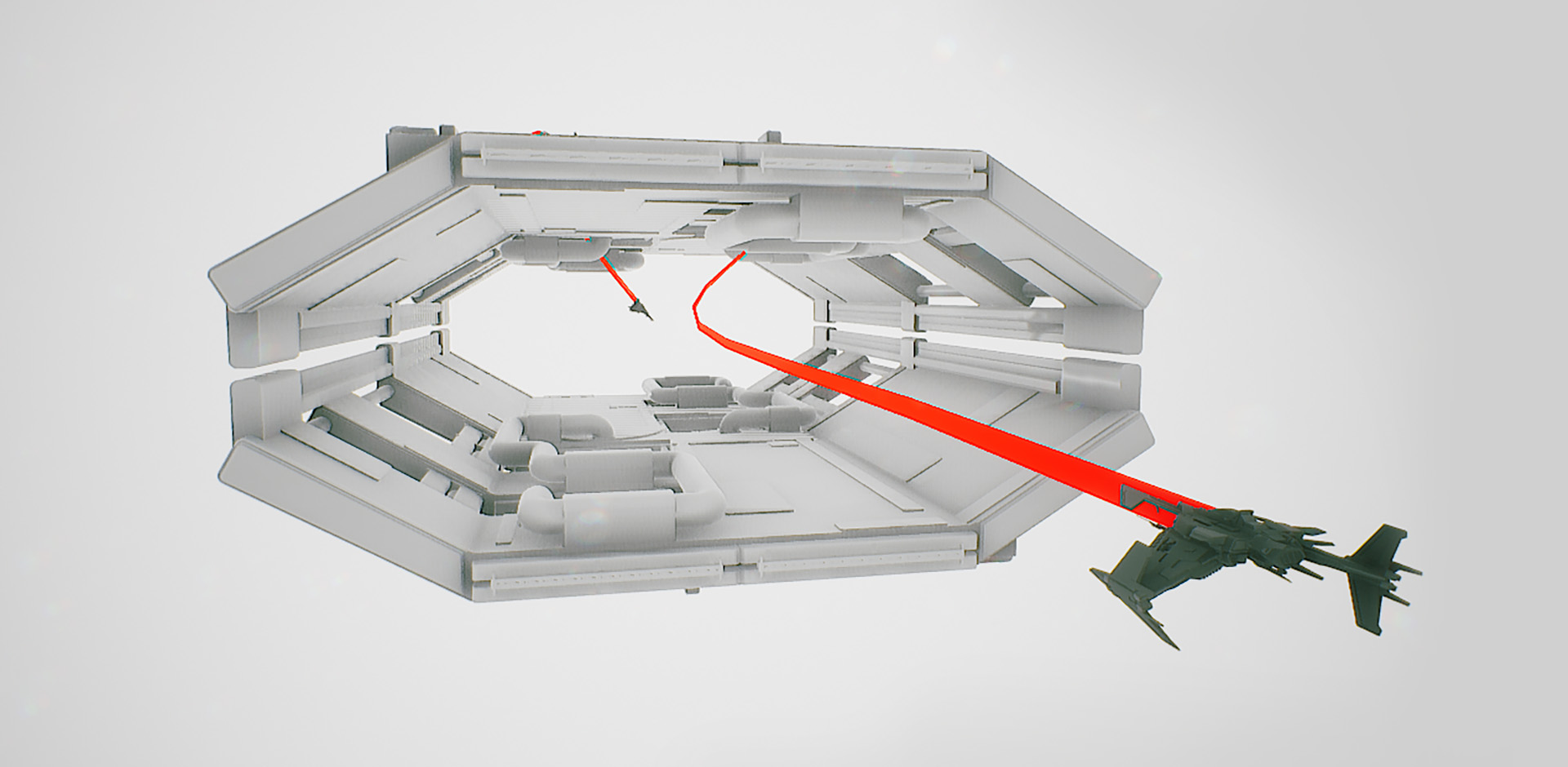
TL;DR: Weeee… Pew-Pew… BOOM! 💥🚀
Cheers,
Malte @stang3d
Latest Streams & Let’s Plays
Here is another cool let’s play that we haven’t shared with you, yet:
Also, don’t miss tonight’s stream where we gonna have a little surprise for Erik when he will be demoing the WIP tutorial mission(!) of EVERSPACE 2 on the Rockfish Games channel on Twitch, on our YouTube channel and on mixer from 8pm to 10pm CEST / 2pm to 4pm EDT.
Over and out,
Michael &
your dedicated ROCKFISH Games Team
